In this Blog, Rachel Wood, Level 3 BA Fine Art Textiles student at Orkney College UHI, documents the process of curating an exhibition from the Pier Arts Centre’s Collection.
We have been given the task to work as a group of 6 people to come together as a team and curate a mini exhibition with the use of the Pier Arts Centre’s permanent collection. The brief allows us to be open to any themes, any artists and any selection of works.
The outcome should include effectively working alongside the professional staff at the Pier, efficiently operating as a learning group of curators, thoroughly recording all processes, and finally a successful exhibition at the Pier Arts Centre.
Exhibition will open on the 9th of March, with installation days being the 7th and 8th
On the 27th of November we had our first meeting at the Pier Arts Centre to go over the brief and discuss any first thoughts we had. We were shown the room that the exhibition would take place in so we had a visual idea of what we had to work with.
Speaking as a group and looking at the book including the Pier’s permanent collection, we all put forward some of our favourite artists as a starting point. These included artists such as Ben Nicholson, Margaret Gardiner, Alan Johnston, Anish Kapoor, Barbara Hepworth, Sara Barker and Margaret Mellis. Through looking at some of these artists and works we came up with some early themes that we could base the exhibition around, which included mixed media, abstract, geometric form, relief, line, black and white contrast with colour, impact, contrast, and for artists such as Barbara Hepworth to have her sculptural work and graphic work. Personally, at this point I was most drawn to the theme of black and white works contrasting with vibrant coloured pieces due to my love for Anish Kapoor’s etchings.
At the second meeting at the Pier on the 18th of December, the group managed to narrow down the works to a selection of 9 works and 8 artists along with the theme of ‘FLOW’.
The theme of flow was raised through the ideas of having the chosen works blend and work well as a whole. The thought of having the colours and/or shades evolve around the room.
The artists and works that had been chosen were as follows:
• Ben Nicholson – ‘3 circles’
• Bet Low – ‘Calm Water (at Mill Bay, Hoy)’
• Garry Fabian Miller – ‘Towards a Solar Eclipse’ (4 April) and (18 May)
• Anish Kapoor – 2 of his ‘12 Etchings’
• Roger Hilton – ‘Black and Brown’
• Kenneth Armitage – ‘Maquette for the Krefeld War Memorial ’
• Barbara Hepworth – ‘Two Forms (Orkney)’
• Edward Paolozzi – ‘Untitled 1965’
These artists and their works were chosen as we felt they all had links within the works to one another and sat well together. The pieces had similar attributes of shapes and forms (circles/curved line), similar colour schemes that was important for the theme of flow and similar looks due to how they were created.
On the 22nd of January we were back at the Pier to see the physical artworks we had chosen, to see them in the room and to possibly arrange and cut down/change what we had initially concluded.

We started by seeing the Anish Kapoor collection of etchings as we knew they were the largest pieces and that we were probably going to have two of them. To begin with we were drawn to the brown and deep red/yellow and orange coloured ones in the aspect we knew the other works we had chosen had similar colours that we could all link together.

Personally, I preferred the blue and red/pink ones as they just took my attention more than the brown and more subtle ones.

We then brought out the Garry Fabian Miller Eclipse pieces and stood them along side the majority favoured Kapoor works.

When seeing these standing together, I liked it but knew it just wasn’t quite right. I really thought the red and orange glow etching worked well with the Fabian Miller works as they linked, and both evoked the softness and luminescent feel. But the brown etching just wasn’t working. I suggested trying one of the blue etchings in replace of it just for a mix in colour and because some of the other works we had chosen had blue tones also.
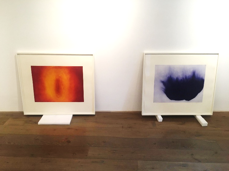
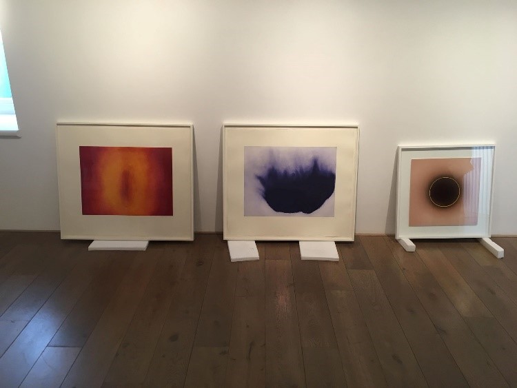
I immediately thought this worked so much better. The orange and red and blue bounced off each other and made one another stand out more. The darkness of the blue still linked with the ‘Eclipse’ pieces with their darkness in the middle, and it still had a wispiness to it also. The blue piece having a harsher line and the movement of it also linked very well to the Paolozzi sculpture in the middle of the space.
After good debate we were finally happy with that outcomes, meaning it was now time to see the other pieces we had initially chosen. Next was Calm Water (at Mill Bay, Hoy) by Bet Low. I think it felt smaller than most of us had imagined but we still loved and wanted to include it. The blue/grey soft tones tied in with the blue etching, also the yellow strip of moonlight reflection allied with the red and orange one.


We tried it alongside the Fabian Miller works but felt each of the two artists pieces would breathe and stand out more on their own.
Then was the Ben Nicholson ‘3 Circles’. Again, it was smaller than we initially thought but still agreed to keep it in the collection.

Roger Hilton ‘Black & Brown’ was next to be taken out. With then seeing all the pieces together it looked slightly empty, so we were suggested to look at another artist or another work from one we already had. We chose to add another Hilton piece, and we all agreed on the ‘Brown, Yellow & Black’.

In our initial selection of works and artists we had included sculptures ‘Two Forms’ by Barbara Hepworth and ‘Bronze 1956’ by Kenneth Armitage but were advised at first that what we already had collected and placed within the space was enough and worked well but also for security reasons it would be too difficult to have them. This is because we had thought about placing them in the two windows, forgetting that there would need to be a screen or some sort of barrier between the sculpture and public to ensure its safety.
But this now meant between the six of us we had 6 artists to each write about. The concluded artists and works are as follows –
• Anish Kapoor – 2 Etchings
• Garry Fabian Miller – 2 of the ‘Eclipse’
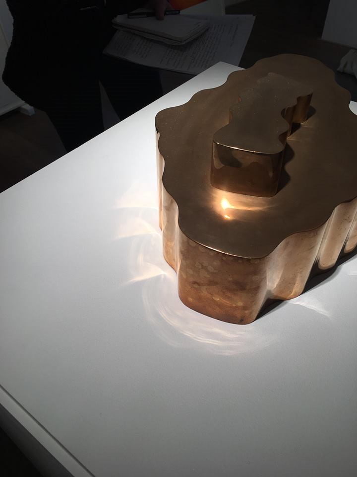
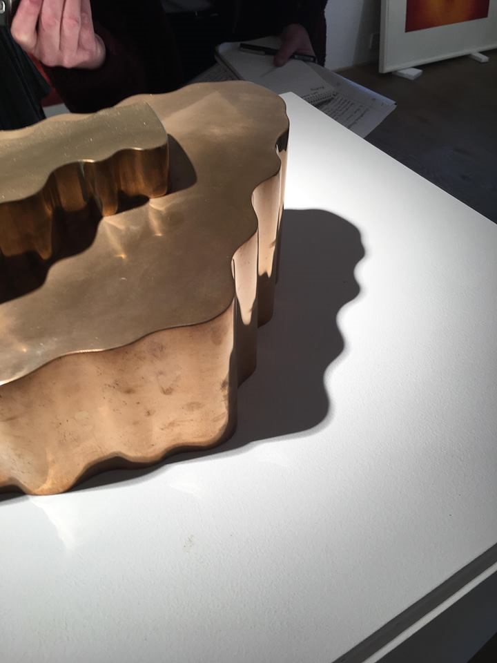
• Edward Paolozzi – ‘Untitled 1965’
• Bet Low – ‘Calm Water’
• Ben Nicholson – ‘3 Circles’
• Roger Hilton – ‘Black & Brown’, ‘Brown, Yellow & Black’
I felt through that process we worked brilliantly as a team, listening to what one another had to say and suggest, always being open to change. Andrew gave us space to have our own thoughts and ideas but gave great advice when we needed it. Even though 6 people in a group for this type of project can be a lot for some people, it worked. This is probably due to our relationship as a close net group already, we are always around each other giving advice and constructive criticism and always have each other’s best interest. Working as a group gave a calmer feeling to the first-time experience of doing something like this and will allow me to feel more confident in myself if I ever had to do it on my own or another group again.
Flow: Transitions of Shape and Form is on display at the Pier Arts Centre until Saturday 23 March 2019.